Bakers Court
Residential Destination
Every place has a story. Bakers Court had one long before the first plans were drawn. When Metrostav Development approached us, our role was not only to name and design the project, but to uncover and interpret this narrative. We set out to translate the site’s heritage into a contemporary brand, one that would feel authentic, grounded in context and at the same time relevant for modern urban living.
Starting from the site’s history, character and its connection to Prague’s breadmaking tradition, we developed a clear concept where the baker becomes a symbol of creation, everyday life and community. From this idea, we created a unified identity system that connects the past with contemporary living across all touchpoints from naming and identity to digital and physical applications.
Strategic Concept • Brand Narrative • Creative Vision • Outdoor & Print Communication • Website Design & Structure
Czech Republic
2026
Metrostav Development
Every place has a story. Bakers Court had one long before the first plans were drawn. When Metrostav Development approached us, our role was not only to name and design the project, but to uncover and interpret this narrative. We set out to translate the site’s heritage into a contemporary brand, one that would feel authentic, grounded in context and at the same time relevant for modern urban living.
Starting from the site’s history, character and its connection to Prague’s breadmaking tradition, we developed a clear concept where the baker becomes a symbol of creation, everyday life and community. From this idea, we created a uni ed identity system that connects the past with contemporary living across all touchpoints from naming and identity to digital and physical applications.
Strategic Concept • Brand Narrative • Creative Vision • Outdoor & Print Communication • Website Design & Structure
Czech Republic
2026
Metrostav Development
Creative vision
Bakers Court is based on the transformation of a historically industrial site into a contemporary urban destination with a clear identity. It draws from the legacy of the original bakery and its founder. Not as a static reference, but as a living principle. We reinterpret this heritage as a symbol of human creativity, progress and cultural continuity. The result is an environment shaped not only by architecture, but by life itself. By people, creativity and the energy of the city.
Naming system & Logo
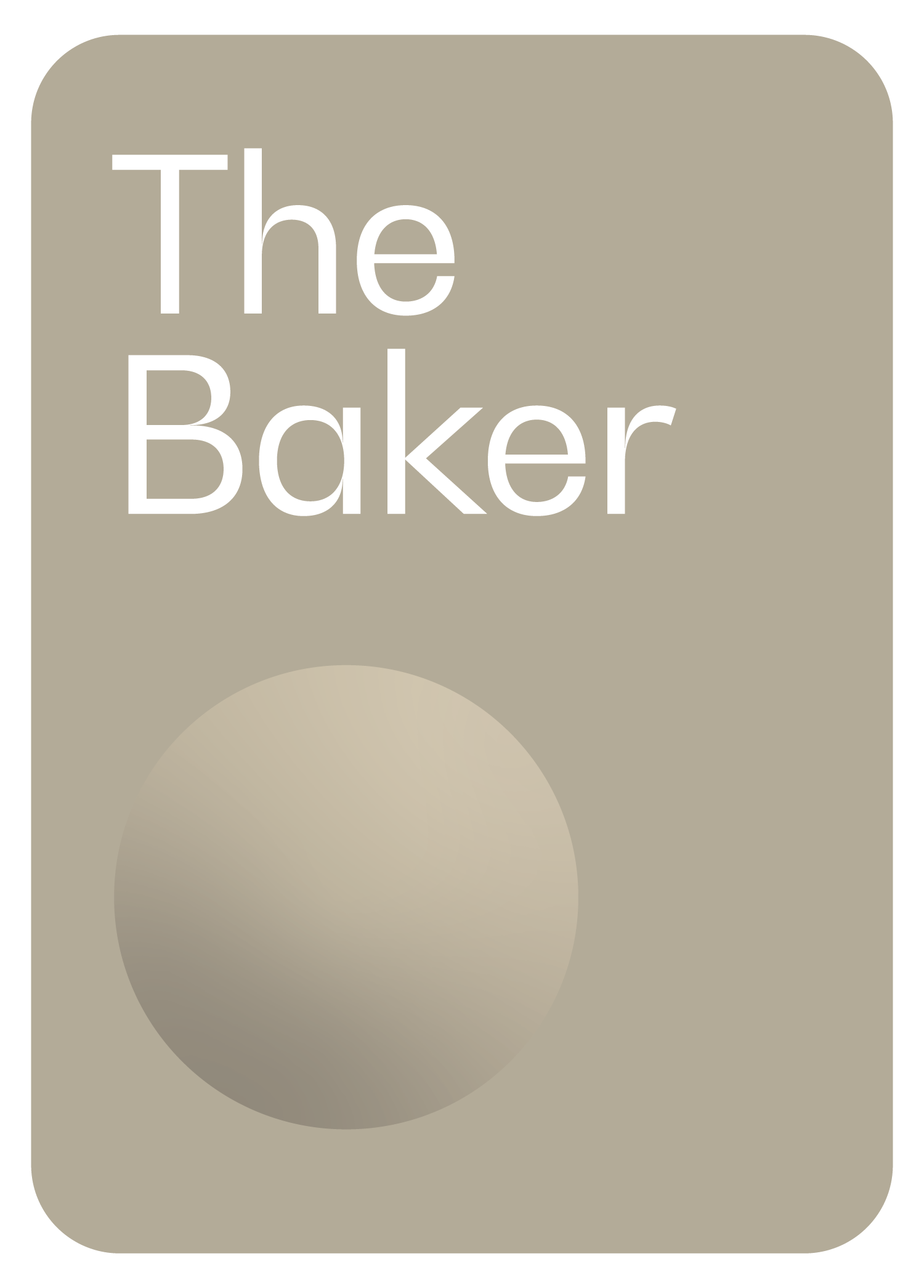
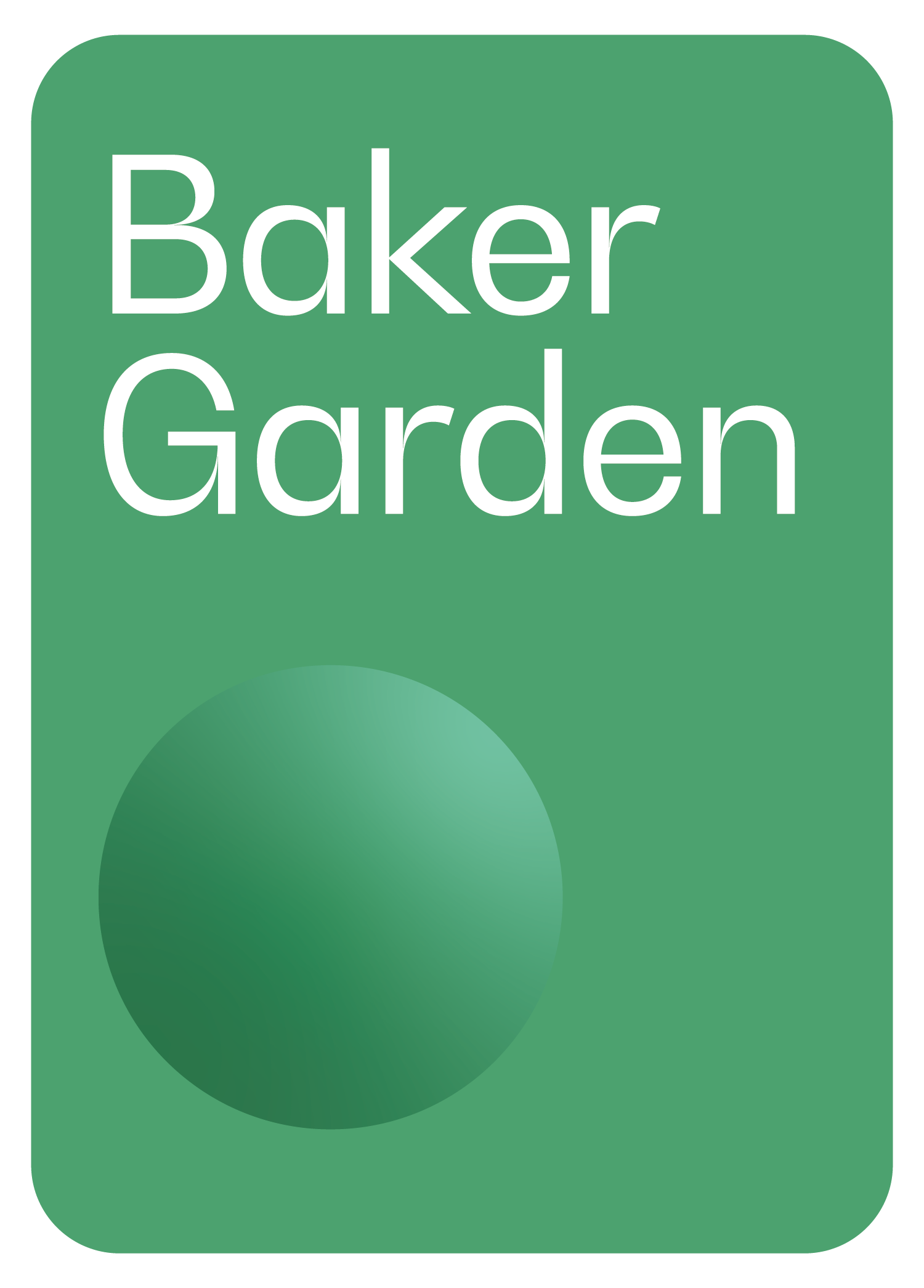
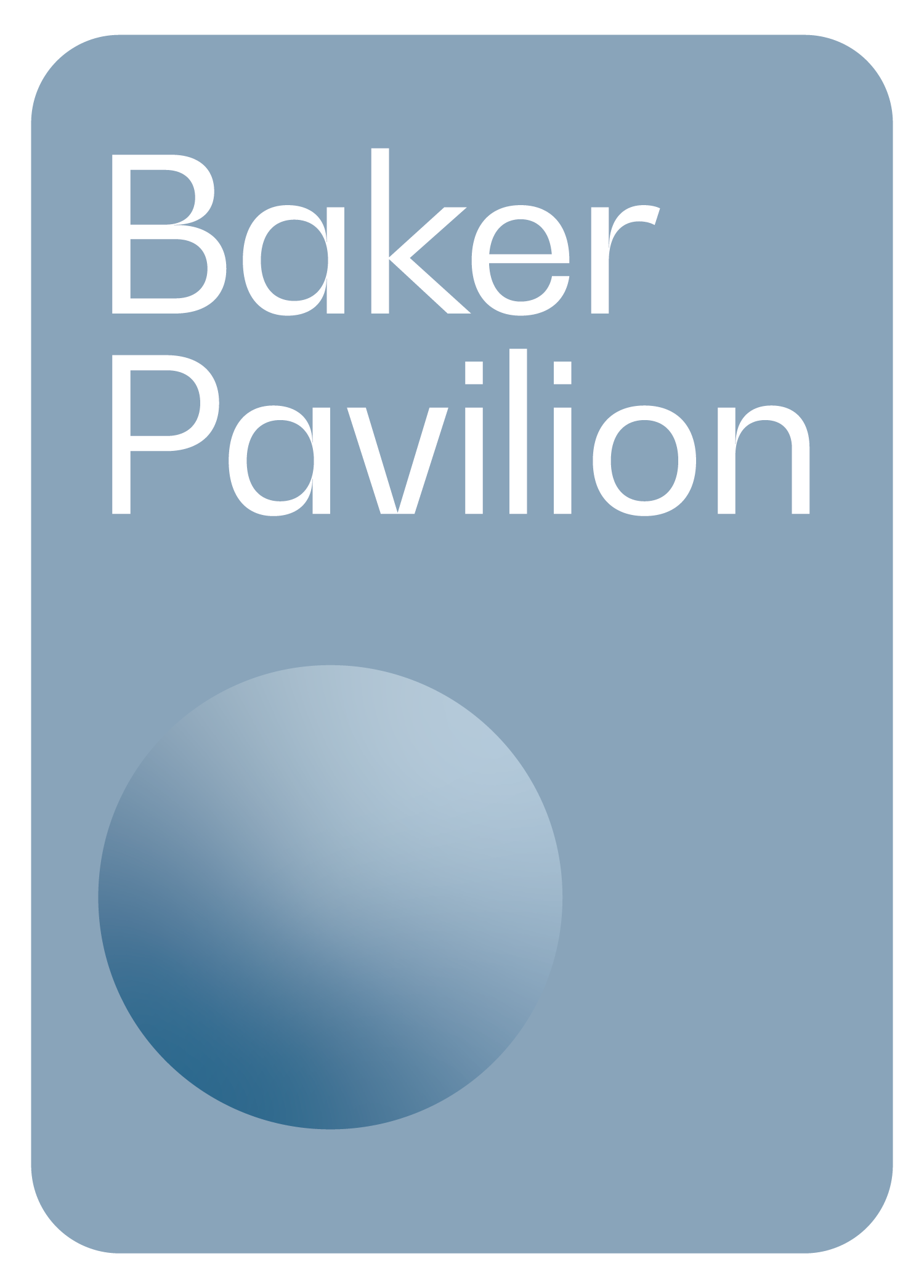
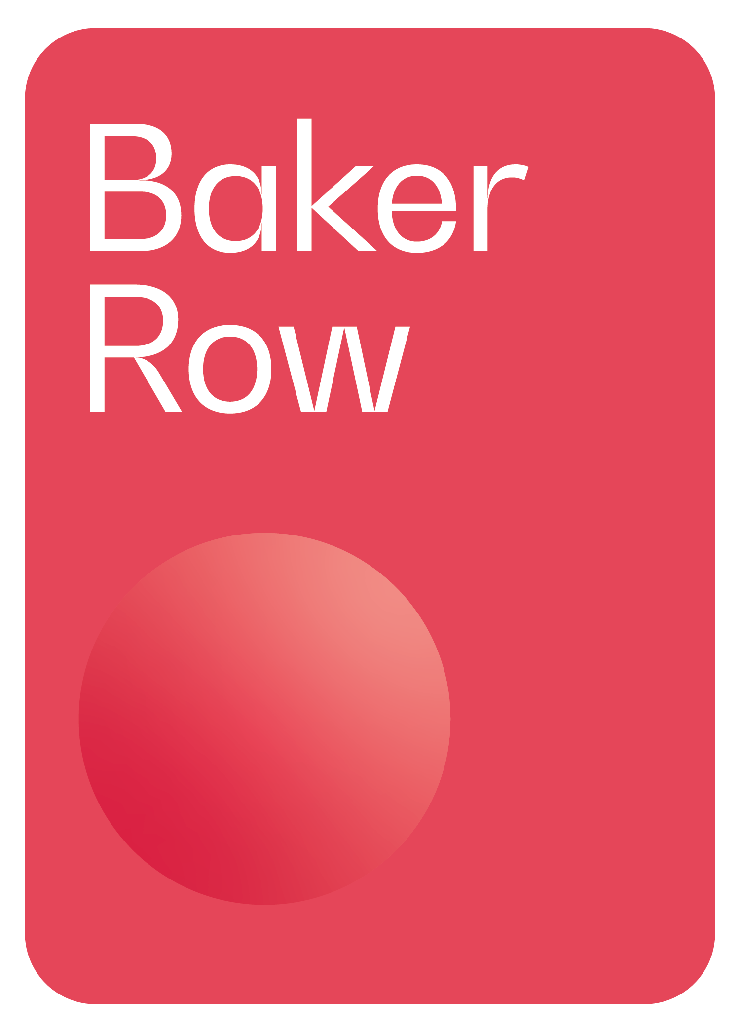
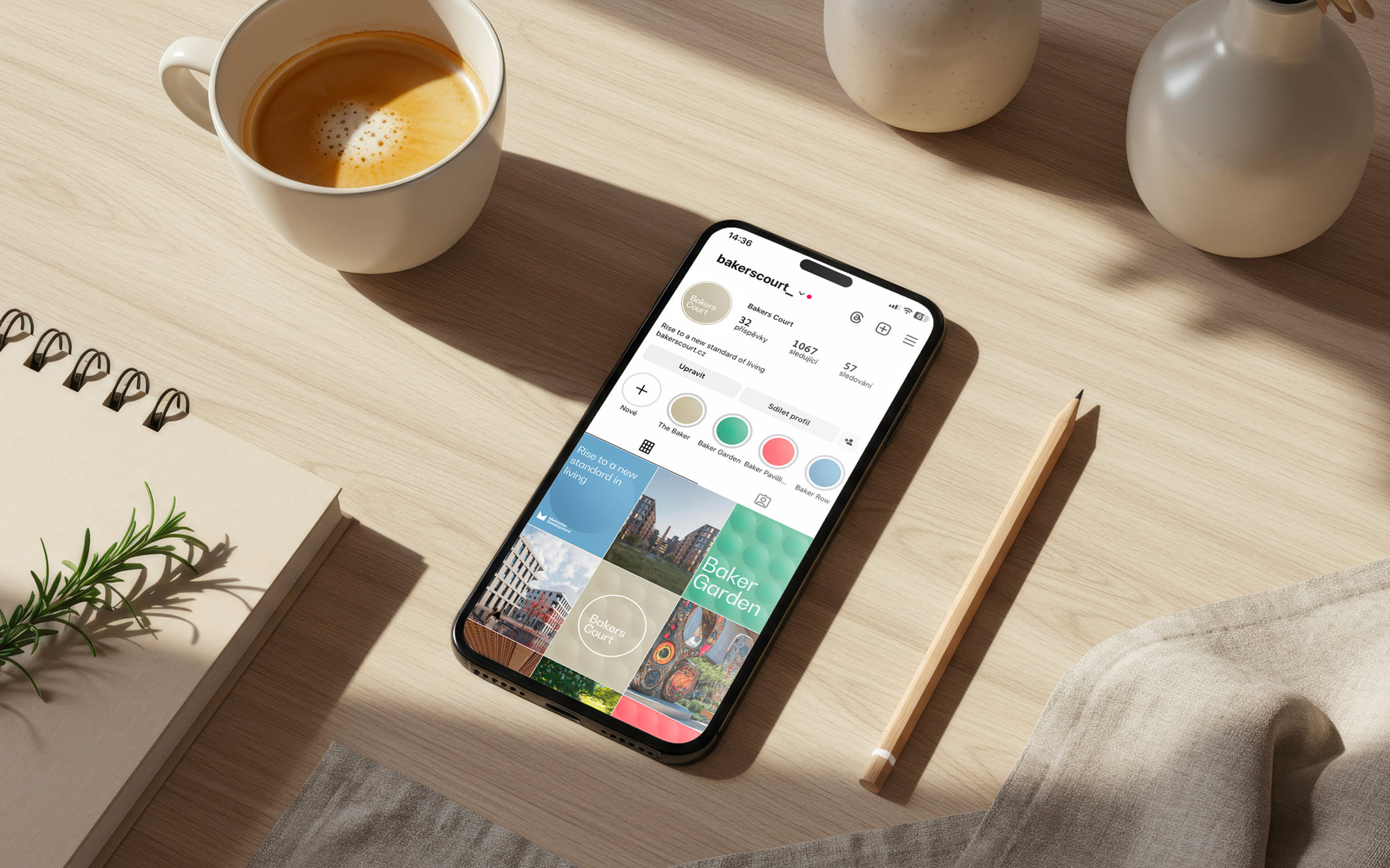
The name Bakers Court grows directly from the character of the place and its history. The baker becomes a central symbol of creation, everyday rhythm and quiet progress. This idea forms the foundation of a clear naming system. The four buildings The Baker, Baker Garden, Baker Pavilion and Baker Row extend the central narrative while defining their own identities. Together, they create a structure that is coherent and easy to navigate.
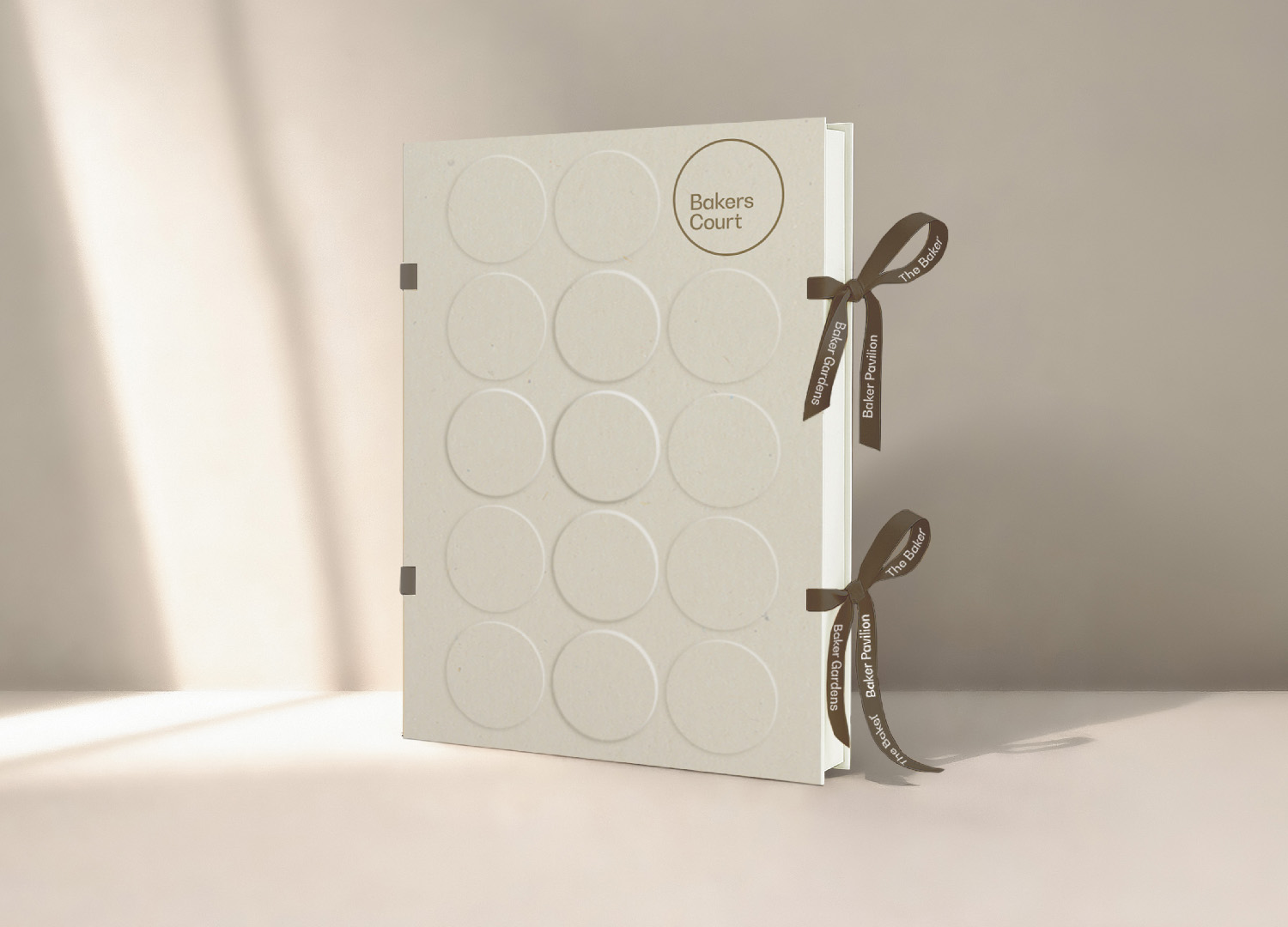
The logo is based on a simple circular form inspired by a loaf of bread. A subtle reference to the site’s heritage. This minimal gesture gives the brand a timeless and recognisable quality, while reinforcing its connection to the story of the place.


Naming system & Logo
The name Bakers Court grows directly from the character of the place and its history. The baker becomes a central symbol of creation, everyday rhythm and quiet progress. This idea forms the foundation of a clear naming system. The four buildings The Baker, Baker Garden, Baker Pavilion and Baker Row extend the central narrative while defining their own identities. Together, they create a structure that is coherent and easy to navigate.
The logo is based on a simple circular form inspired by a loaf of bread. A subtle reference to the site’s heritage. This minimal gesture gives the brand a timeless and recognisable quality, while reinforcing its connection to the story of the place.
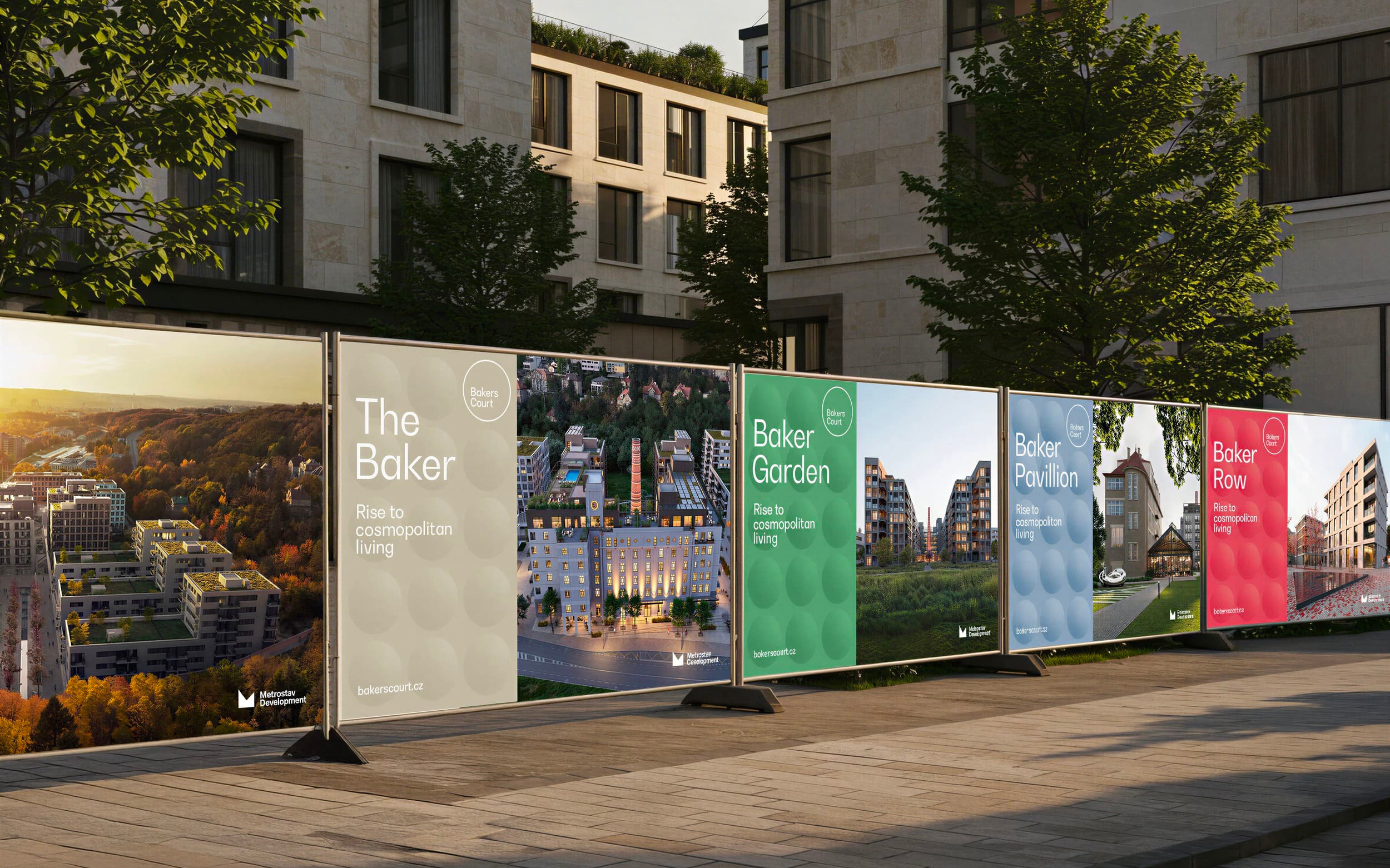
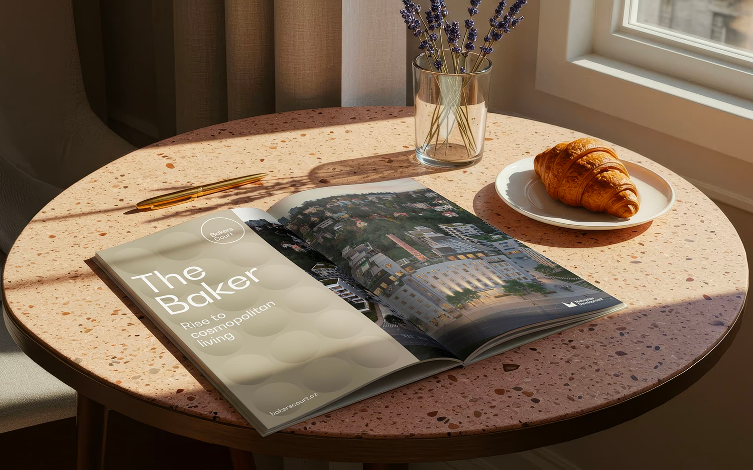
Key Visual & Print
The key visual is built on a clear and consistent layout. It combines strong architectural imagery with a distinctive colour system for each building. The system allows for easy recognition while giving each part of the development its own identity.
It is designed to scale across all print applications, from billboards and site fencing to smaller formats. Its clarity and contrast ensure strong visibility in the city, while maintaining a refined and cohesive presence.

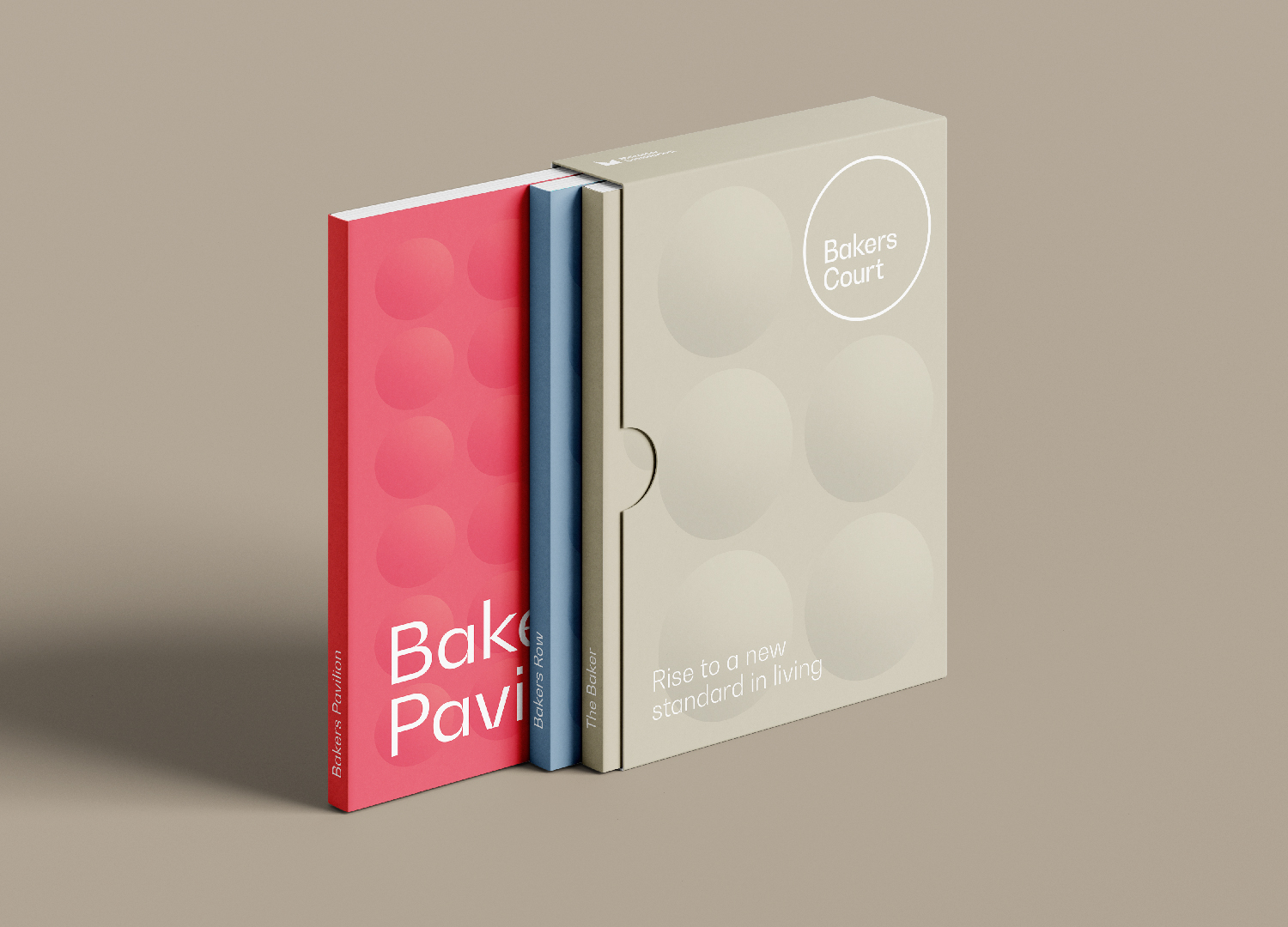
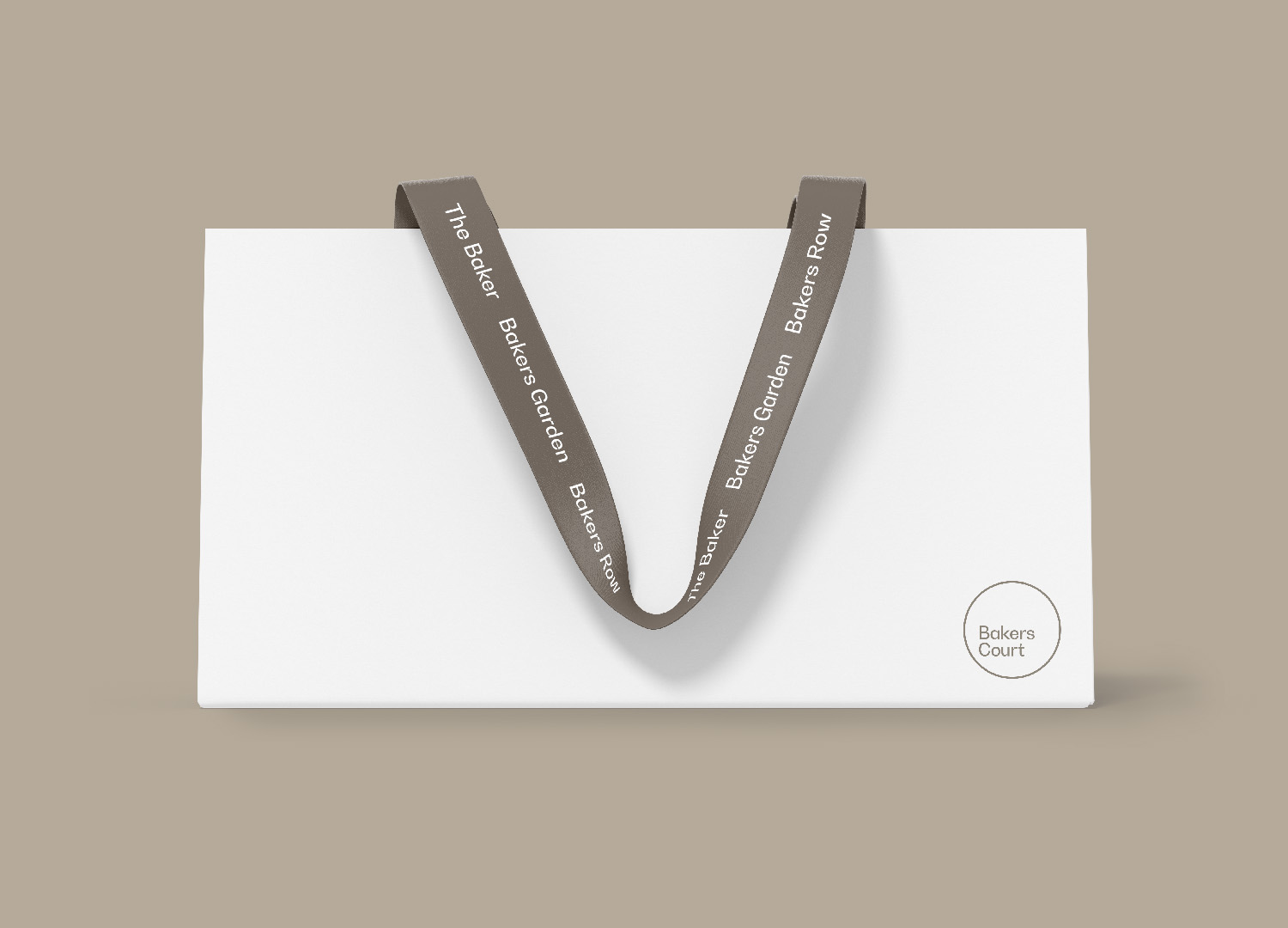
Corporate Suite
We designed a complete set of corporate materials, including business cards, folders, brochures, and packaging. Each element reflects the same visual logic and attention to detail, supporting a cohesive and professional presentation of the project.
Online presence
The website translates the brand into a digital experience. It communicates the story, architecture and lifestyle of Bakers Court in a clear and structured way while maintaining a calm and refined visual tone. In parallel, we defined the visual and content direction for social media, ensuring consistency across all ongoing communication.

CGI by Monolot studio.

Signage & Wayfinding
The signage for the sales centre establishes the first physical expression of the Bakers Court identity. Clear, confident and easy to navigate, it introduces visitors to the tone of the destination while ensuring an intuitive and welcoming experience from the very first contact.
Drop us a line at. [email protected]
Drop us a line at. [email protected]
Prague
Churchill I
Italská 2581/67
120 00 Praha 2
Czechia
Henceforth. is a strategic consultancy for real estate, hospitality and luxury brands.
Prague / Bratislava / Vienna / Berlin / Milano / Dubai
Henceforth. is a strategic consultancy for real estate, hospitality and luxury brands.
Prague
Churchill I
Italská 2581/67
120 00 Praha 2
Czechia
Prague / Bratislava / Vienna / Berlin / Milano / Dubai
Henceforth. is a strategic consultancy for real estate, hospitality and luxury brands.
Prague
Churchill I
Italská 2581/67
120 00 Praha 2
Czechia
Prague / Bratislava / Vienna / Berlin / Milano / Dubai